

A great user journey turns visitors into engaged customers—and well-placed Call-to-Actions (CTAs) are the key to making that happen. Here’s how to design seamless user experiences that guide people toward action.
1. Map Out the User Journey First
Before adding CTAs, understand how users navigate your site. Ask:
🔹 Where do they land first? (Homepage, blog, product page?)
🔹 What information do they need before taking action?
🔹 What’s the final goal? (Purchase, signup, contact?)
Create a flow that logically guides them from discovery → engagement → conversion.
2. Use Clear & Compelling CTAs at Each Stage
Different CTAs work for different stages of the journey:
✅ Awareness Stage (First Visit)
- CTA: “Learn More”, “Discover Our Story”, “See How It Works”
- Placement: Homepage, about page, blog posts
✅ Consideration Stage (Evaluating Options)
- CTA: “See Pricing”, “Try a Free Demo”, “Download the Guide”
- Placement: Product pages, case studies, comparison pages
✅ Conversion Stage (Taking Action)
- CTA: “Buy Now”, “Get Started”, “Sign Up for Free”
- Placement: Checkout page, landing pages, pop-ups
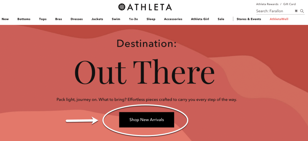
3. Make CTAs Stand Out
🎨 Use contrasting colors to make CTAs pop.
📝 Be direct—”Get Started Free” works better than “Click Here.”
📍 Position them strategically—above the fold and at decision points.
4. Create a Sense of Urgency
🚀 Add time-sensitive wording:
- “Limited Offer – Claim Your Discount!”
- “Only a Few Spots Left – Sign Up Now!”
💡 Bonus: Try A/B testing different CTA texts to see what converts best.
5. Optimize for Mobile
Over 50% of users browse on mobile, so:
📱 Make CTAs large enough to tap easily.
📱 Keep text short & clear.
📱 Ensure fast page load speeds for smooth navigation.
Final Takeaway
A well-placed, compelling CTA can turn casual visitors into loyal customers. Focus on clear messaging, strategic placement, and a seamless user journey to drive conversions. 🚀